Self-Organizing Maps | Model & Results
This notebook uses minisom instead of Scikit Learn because Scikit does not implement self organizing maps. It is therefore necessary to install minisom. To do this, run the cell below. After running the cell, you may need to go to Kernel > Restart in the menu bar above to run the rest of the notebook.
pip install minisom
Load the wine data set.
from sklearn.datasets import load_wine
from sklearn.preprocessing import MinMaxScaler
from minisom import MiniSom
import matplotlib.pyplot as plt
# Load the wine dataset
data = load_wine()
X = data.data
target = data.target
label_names = data.target_names
Scale the data.
# Scale the data
scaler = MinMaxScaler()
X = scaler.fit_transform(X)
Initialize the SOM and train it. The quantization error measures the quality of the learning and is equal to the average difference of the input samples compared to its corresponding winning neurons. A lower value is better.
# Initialization and training
n_neurons = 9
m_neurons = 9
som = MiniSom(n_neurons, m_neurons, X.shape[1], sigma=1.5, learning_rate=.5,
neighborhood_function='gaussian', random_seed=0)
som.pca_weights_init(X)
som.train(X, 1000, verbose=True) # random training
[ 0 / 1000 ] 0% - ? it/s
[ 0 / 1000 ] 0% - ? it/s
[ 1 / 1000 ] 0% - 0:00:00 left
[ 2 / 1000 ] 0% - 0:00:00 left
[ 3 / 1000 ] 0% - 0:00:00 left
[ 4 / 1000 ] 0% - 0:00:00 left
[ 5 / 1000 ] 0% - 0:00:00 left
[ 6 / 1000 ] 1% - 0:00:00 left
[ 7 / 1000 ] 1% - 0:00:00 left
[ 8 / 1000 ] 1% - 0:00:00 left
[ 9 / 1000 ] 1% - 0:00:00 left
[ 10 / 1000 ] 1% - 0:00:00 left
[ 11 / 1000 ] 1% - 0:00:00 left
[ 12 / 1000 ] 1% - 0:00:00 left
[ 13 / 1000 ] 1% - 0:00:00 left
[ 14 / 1000 ] 1% - 0:00:00 left
[ 15 / 1000 ] 2% - 0:00:00 left
[ 16 / 1000 ] 2% - 0:00:00 left
[ 17 / 1000 ] 2% - 0:00:00 left
[ 18 / 1000 ] 2% - 0:00:00 left
[ 19 / 1000 ] 2% - 0:00:00 left
[ 20 / 1000 ] 2% - 0:00:00 left
[ 21 / 1000 ] 2% - 0:00:00 left
[ 22 / 1000 ] 2% - 0:00:00 left
...
[ 998 / 1000 ] 100% - 0:00:00 left
[ 999 / 1000 ] 100% - 0:00:00 left
[ 1000 / 1000 ] 100% - 0:00:00 left
quantization error: 0.2788823341100978
Visualizing the Results
There is a number of different visualizations that are helpful for understanding the result of our trained classifier.
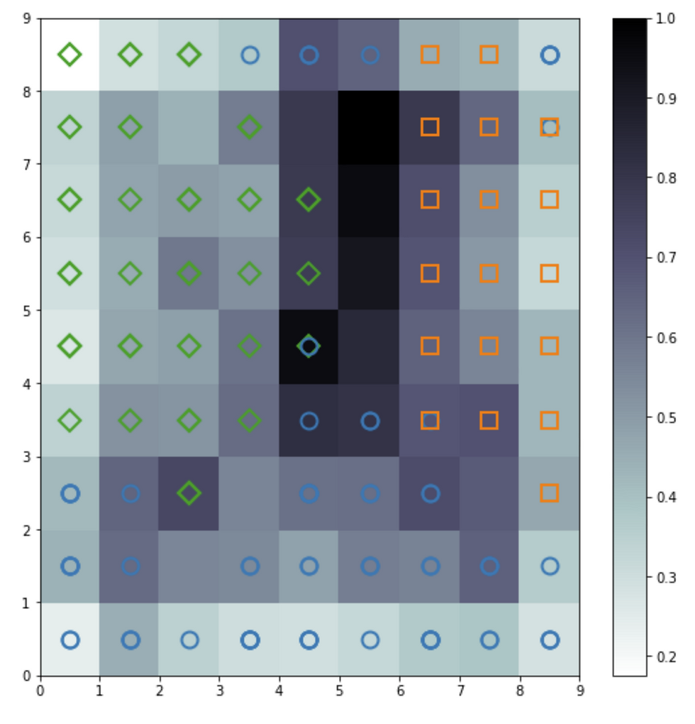
Distance Map
The distance map, also called a U-Matrix, displays the results of the training as an array of cells. The color of each cell represents the distance from that neuron to the neighbor neuron. The symbols on top of the cell represent the samples that are mapped to that specific cell.
import matplotlib.pyplot as plt
%matplotlib inline
plt.figure(figsize=(9, 9))
plt.pcolor(som.distance_map().T, cmap='bone_r') # plotting the distance map as background
plt.colorbar()
# Plotting the response for each pattern in the wine dataset
# different colors and markers for each label
markers = ['o', 's', 'D']
colors = ['C0', 'C1', 'C2']
for cnt, xx in enumerate(X):
w = som.winner(xx) # getting the winner
# palce a marker on the winning position for the sample xx
plt.plot(w[0]+.5, w[1]+.5, markers[target[cnt]-1], markerfacecolor='None',
markeredgecolor=colors[target[cnt]-1], markersize=12, markeredgewidth=2)
plt.show()
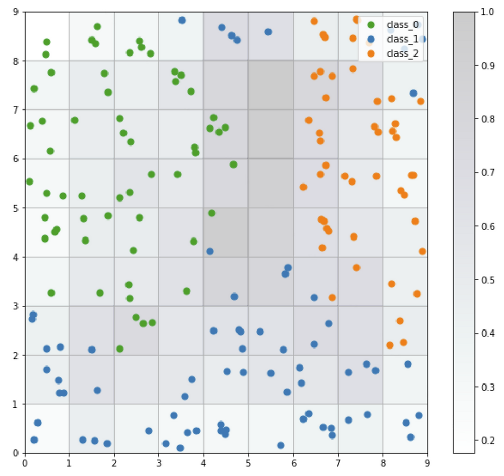
Seeds Map
The seeds map is a visualization of how the samples are distributed across the map. The seeds map uses a scatter chart and each dot represents the coordinates of the winning neuron. Where multiple points are located in the same cell, the coordinate is offset by a random distance to avoid overlap.
import numpy as np
w_x, w_y = zip(*[som.winner(d) for d in X])
w_x = np.array(w_x)
w_y = np.array(w_y)
plt.figure(figsize=(10, 9))
plt.pcolor(som.distance_map().T, cmap='bone_r', alpha=.2)
plt.colorbar()
for c in np.unique(target):
idx_target = target==c
plt.scatter(w_x[idx_target]+.5+(np.random.rand(np.sum(idx_target))-.5)*.8,
w_y[idx_target]+.5+(np.random.rand(np.sum(idx_target))-.5)*.8,
s=50, c=colors[c-1], label=label_names[c])
plt.legend(loc='upper right')
plt.grid()
plt.show()
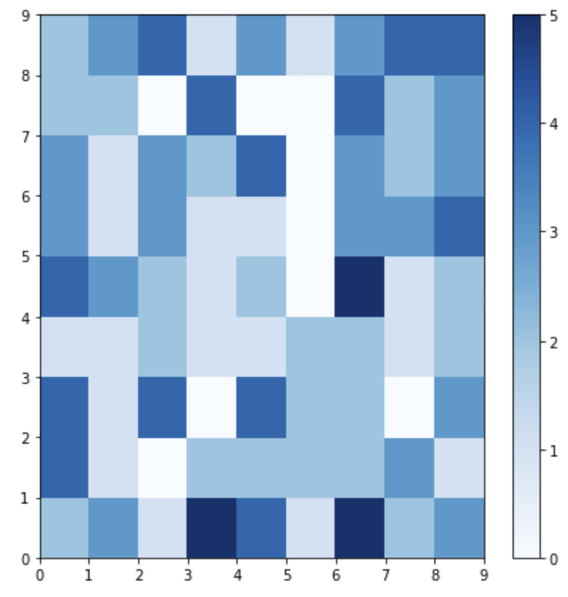
Neuron Activation
The plot below shows which neurons are activated the most by coding the number of times each neuron is activated (0 through 5 times) as a color to the location of each neuron.
plt.figure(figsize=(7, 7))
frequencies = som.activation_response(X)
plt.pcolor(frequencies.T, cmap='Blues')
plt.colorbar()
plt.show()
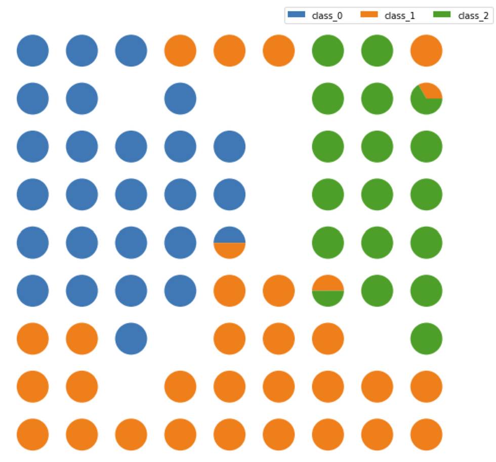
Class Assignment
The Class Assignment can be visualized when SOMs are applied to a supervised learning problem. The proportion of samples per class that fall in a specific neuron are visualized using a pie chart for each neuron.
import matplotlib.gridspec as gridspec
labels_map = som.labels_map(X, [label_names[t] for t in target])
fig = plt.figure(figsize=(9, 9))
the_grid = gridspec.GridSpec(n_neurons, m_neurons, fig)
for position in labels_map.keys():
label_fracs = [labels_map[position][l] for l in label_names]
plt.subplot(the_grid[n_neurons-1-position[1],
position[0]], aspect=1)
patches, texts = plt.pie(label_fracs)
plt.legend(patches, label_names, bbox_to_anchor=(3.5, 6.5), ncol=3)
plt.show()