
K-means Clustering | Notebook
Make random dataset
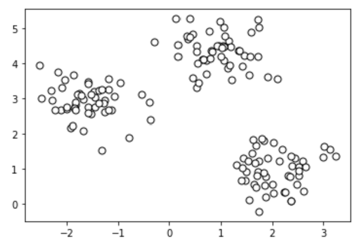
For this example, we will use a randomly generated dataset. Below, we generate this dataset using the SkiKit Learn methods.
import matplotlib.pyplot as plt
from sklearn.datasets import make_blobs
# create dataset
X, y = make_blobs(
n_samples=150, n_features=2,
centers=3, cluster_std=0.5,
shuffle=True, random_state=0
)
# plot
plt.scatter(
X[:, 0], X[:, 1],
c='white', marker='o',
edgecolor='black', s=50
)
plt.show()
Implement K-Means
from sklearn.cluster import KMeans
clusters = 3
km = KMeans(
n_clusters=clusters, init='random',
n_init=10, max_iter=300,
tol=1e-04, random_state=0
)
y_km = km.fit_predict(X)
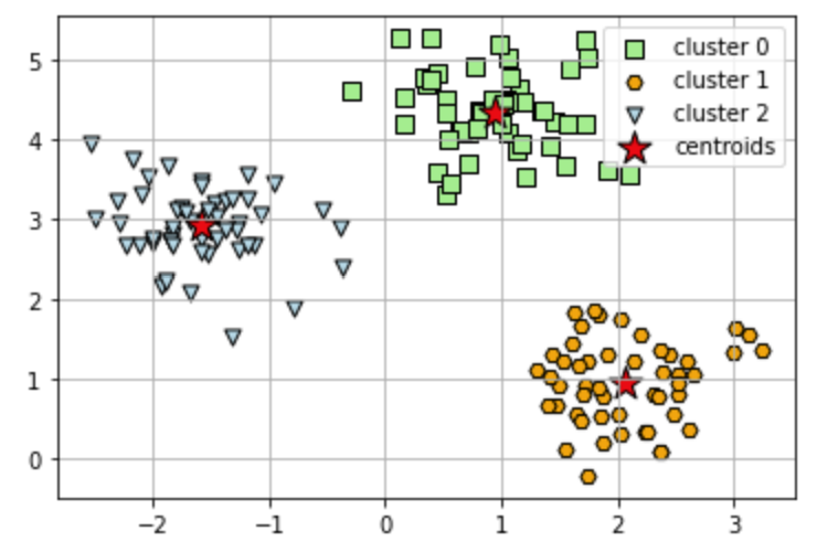
To visualize the result, we can plot the clusters and the centroids using MatPlotLib.
# plot the 3 clusters
colors = ['lightgreen', 'orange', 'lightblue', 'lightcoral', 'gold', 'plum', 'midnightblue', ' indigo', 'sandybrown']
markers = ['s', 'H', 'v', 'p', '^', 'o', 'X', 'd', 'P' ]
for i in range(clusters):
plt.scatter(
X[y_km == i, 0], X[y_km == i, 1],
s=50, c=colors[i],
marker=markers[i], edgecolor='black',
label='cluster ' + str(i)
)
# plot the centroids
plt.scatter(
km.cluster_centers_[:, 0], km.cluster_centers_[:, 1],
s=250, marker='*',
c='red', edgecolor='black',
label='centroids'
)
plt.legend(scatterpoints=1)
plt.grid()
plt.show()
Elbow method
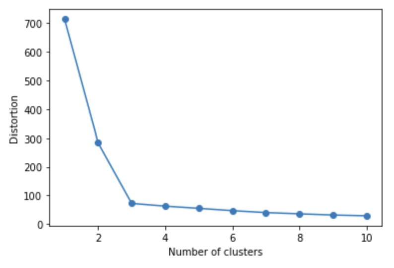
In order to determine the optimal *k* value, it is possible to use an elbow graph. This graph plots the number of clusters against the distortion. The optimal value for *k* is at the 'elbow' in the graph. In the graph below, for example we can see that it is 3.
# calculate distortion for a range of number of cluster
distortions = []
for i in range(1, 11):
km = KMeans(
n_clusters=i, init='random',
n_init=10, max_iter=300,
tol=1e-04, random_state=0
)
km.fit(X)
distortions.append(km.inertia_)
# plot
plt.plot(range(1, 11), distortions, marker='o')
plt.xlabel('Number of clusters')
plt.ylabel('Distortion')
plt.show()
TASK 1: In the classifier below, set n_clusters to 4 by changing the value of the variable "clusters" to 4, and see how the clustering changes.
clusters = 3
km = KMeans(
n_clusters=clusters, init='random',
n_init=10, max_iter=300,
tol=1e-04, random_state=0
)
y_km = km.fit_predict(X)
# plot the 3 clusters
colors = ['lightgreen', 'orange', 'lightblue', 'lightcoral', 'gold', 'plum', 'midnightblue', ' indigo', 'sandybrown']
markers = ['s', 'H', 'v', 'p', '^', 'o', 'X', 'd', 'P' ]
for i in range(clusters):
plt.scatter(
X[y_km == i, 0], X[y_km == i, 1],
s=50, c=colors[i],
marker=markers[i], edgecolor='black',
label='cluster ' + str(i)
)
# plot the centroids
plt.scatter(
km.cluster_centers_[:, 0], km.cluster_centers_[:, 1],
s=250, marker='*',
c='red', edgecolor='black',
label='centroids'
)
plt.legend(scatterpoints=1)
plt.grid()
plt.show()
TASK 2: Choose two features from the wine dataset which are appropriate for clustering and apply K-Means clustering on the data based on those two features.
Don't forget to normalize the input data using a pipeline like we have done in previous notebooks. Check the SVM notebook for an example.